When A Stranger Calls Movie Trailer. Finding the right leading lady to carry the film would be the filmmakers’ top priority. With three main characters: Jill, The House and The Phone, the actress brought on to play “Jill” would have to fill a tall order. She would need to have the ability to convey all the elements the filmmakers needed. Innocence was important.
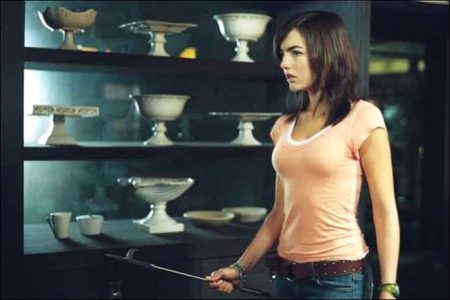
At sixteen years old, the character is on the verge of maturity, but is still very much an innocent young, high school babysitter. On the other hand, she’s then got to step up and fight for her life and beat the bad guy to survive. So this actress would need to convey an enormous arc from happy-go-lucky teenager, to being absolutely traumatized. This had to be done with facial expressions mostly, without using dialogue as a fall back. Camilla Belle would fit the bill perfectly.
“I went after Camilla for many reasons,” recalls Simon West. “I had seen her previous work and I found her to be such an intelligent mature actress, beyond her years. But she still has this rare, innocent quality that a lot of teenagers don’t have anymore because they grow up so fast, especially in the acting profession. So it was very hard to find somebody that has that balance of innocence and accomplishment as an actress.
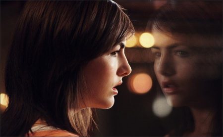
“Aside from being stunningly beautiful, one of Camilla’s strengths is that she’s so engaging on the screen that you really can just watch her without ever having to hear a word of dialogue,” West continues. “She engages you and you can see almost everything she’s thinking in her eyes, in very simple terms.”
“I needed to convince her to take this role, because in the past, she had taken on independent films with deeper characters than you might expect from a thriller or studio picture,” adds the director. “There are so few movies, especially for an eighteen year old, where you are in every shot, every scene, and your character is the arc of the movie, and this was a rare opportunity for her.”
“Audiences are much more sophisticated now than in 1978,” he continues. “They expect more from characters and we see spunkier female leads now. This is one of the reasons I liked the script when I read it. Jill is NOT a victim. She’s the victor. Yes, she gets scared and yes, she’s put in peril, but she fights her way out and uses her brain, brawn and just sheer animal instinct to get out of this situation. Jill is a role model for young girls.”
For Camilla, the fact that the role presented acting challenges, coupled with the chance to portray a strong female character sold her on the project. “Jill is a very strong female character who carries this film all on her own,” says Camilla. “She goes on a very emotional journey. She has to save the children, and save herself. She has a lot of responsibility to get everyone out of the house safely. It’s a real survival story.”
“As an actress, it was challenging because I didn’t have the opportunity to feed off of my co-stars in the way I would in other movies since they were a House and a Phone,” she adds. “I had to act with myself and create things in my mind. I had to essentially go a little crazy in my mind and come up with different scenarios happening around me and that was challenging but exciting as an actress.”
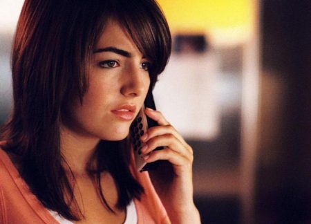
“The hardest thing for me,” she continues, “was when the tension started to build with the Stranger on the phone. The emotions needed to be high and everything became more frightening and the phone calls became much more intense, but for me, it became challenging because I was having to react off of one of the crew guys talking on the phone. It’s not like there is really this scary man on the other end of the line; it’s really acting with yourself and that’s somewhat difficult, because you have to manipulate it in your mind and create something that’s just not there.”
Physically, the role of Jill would be challenging for Camilla as well. The actress worked out with a coach on the studio lot for about a month prior to filming. She worked out in the gym and on the track every day learning how to run and getting in shape for the role. “Jill is an athlete,” explains Camilla. “She’s a runner and is obviously physically strong. She has a lot of physical stamina which helps her in the long run when it comes to fighting off the Stranger, being chased around the house and surviving. This is what saves her. So I needed to make sure I could stand up to this as well.”
Casting… The House
The second thing the filmmakers needed to do was to find the house. Executive Producer Paddy Cullen hired Production Designer Jon Gary Steele. The filmmakers were adamant about getting away from the cliché haunted house, the spooky house audiences have seen a million times — the Gothic, Victorian, American classic house.
The context in which the action happens in the film was extremely important and it was the film’s writer who came up with the ideas for much of the house and the atrium. The producers knew it would be difficult to find the place that would satisfy the demands of the shooting script because of the difficulty in shooting in a real house. Jon Gary Steele and Simon West would collaborate on a design for the interior. Jake Wade Wall wrote the magic that created the three dimensions of the house, including the atrium, and the flow of the action and it was through West and Steele that the house was realized.
“When I was envisioning the film,” says Wall, “I thought to myself we’ve seen the creepy old, Gothic house way too much. It’s now laughable. We’ve seen the standard American house that’s not frightening anymore, and everything’s been so over used in this genre. I wanted to create something special so that every moment you were in this house with Jill, it was constantly revealing itself. I didn’t want it to be a house that you could look at from the outside and say, ok, I know the floor plan. I wanted Jill to get lost in its beauty. I wasn’t even sure of the complete floor plan in the beginning of the film. I started with the front door and I went through the film with Jill and as something would happen, Jill would look down a hallway and my writing eye would look down the hallway with her and I’d say, hmmm, that’s not what I was expecting.”
“I wanted to bring the outside of the house inside,” he continues. “That’s why the atrium is so instrumental for me. I thought it was a nice contrasting visual for a horror film. There’s always something scary about the woods, and to have that in your house would be a nice duality for a thriller. The atrium allows us the feeling that Jill is being watched, like a specimen.
The whole house is an atrium, out on a lake if you think about it. Anyone could be looking and watching her and there’s something very frightening about a girl, alone in a house with someone watching her every move to the point that he can call her and tell her what she is and isn’t doing. Then I thought what a nice moment to shrink it to where she is a moth in a jar inside this house so even if she gets outside, she has to go back through this house again to really get out. You always have the problem of getting the heroine back into the house because no one in his or her right mind would. But if you put her outside in the middle of the house, her last option is, oh my God, I have to go through the house again!
About the House
The House measures 11,000 square feet and was designed by Jon Gary Steele. The interior was built in six weeks, and the exterior was built in five weeks. The interior sat on a stage at Culver Studios stage and the exterior rested on a lake in Franklin Canyon in Los Angeles, a state park, which was meant to double as Colorado.
Steele’s design took on many forms. “We wanted the house to be modern, but didn’t want it to be sterile or cold with white walls,” says the designer. “We wanted it to feel woodsy and warm. We used very few colors and kept with what we call H.C. Colors, historical colors that are earthier. I wanted it to have a uniform look all the way through. Darker tones were used than you would normally use on modern homes because the subject is scary. Wood tones have more of an alive feel and I used them to make the house feel very rich with wood ceilings and floors and a nice dark slate which doesn’t read as cold. We didn’t want to make the family feel elitist, but wanted to show that they have money. We added sculptures and paintings and beautiful furniture to compliment design.
“I wanted the house to feel like somewhat of a maze,” he continues. “It’s kind of like visiting the house of mirrors. When you first walk in the door into the bridge area to the living room, there’s glass running all the way back to the atrium. We didn’t want to reveal too much too soon, so we put opaque glass that we could shoot through and see shapes of whomever was on the other side. We put the dining room overhanging the atrium to get shots that showed depth. We shot from all different rooms into the central space of the atrium to make the house feel even bigger.
I like places that have different level changes and bridges and balconies that overhang other spaces and this house has it all. The atrium is a CRUCIFORM SHAPE in that everywhere you look there are angles and corners and lots of ‘glass-meets-glass’ in the corners. I gave the cinematographer many different things to shoot through. We put a quarter of glass around the whole atrium, and then other areas we made walls of slatted wood to shoot through and to throw patterns on the wall. We made the kitchen with open shelves on both sides, and translucent or opaque glass that can slide all the way back if they wanted to use it to shoot through to get shade and shadow.”
“I cheated in a few places,” adds Steele. “I have balconies that overhang the water that have no railings. The art director kept telling me that I couldn’t do that because with children in the house, that would never be so, but I insisted we do it without railings so it felt a little more dangerous. We did the same with the stair case, we didn’t put a railing on it at all which is quite dangerous. But in filming the fight scene, it made more sense and ultimately looked better. I kept reminding the filmmakers that this is a movie and doesn’t have to always go by every code there is.”
“Finally, we put two stories of glass around the living room,” he adds. “And the balcony leading from the living room to the outside didn’t have a railing either. I thought it brought a real sense of a fishbowl effect with no barriers to the outside which felt, again, more dangerous to me.”
Technology and Terror
When A Stranger Calls was shot in thirty-seven days. Twenty-seven days were spent filming at Culver Studios in Culver City, Los Angeles, and the remaining ten days were spent filming exteriors of the house on location on a lake in Franklin Canyon in Los Angeles. The story, along with the look and feel of this film, is very different from the original and time allowed the filmmakers access to a plethora of advanced technology that the original film didn’t use because it simply didn’t exist then.
“We used a lot of steady-cam and techno-cranes and we hand-held a lot which back then wasn’t the thing to do,” says cinematographer Peter Menzies, Jr. “The camera was definitely treated as more of a third person at times. With a steady-cam, we are allowed to really travel the audience down through the hallways and into the rooms as opposed to just standing back and watching the action happen, which is what the original did a lot because the technology just wasn’t available to them. We are also able to see her point of view a lot, which puts the audience right in there with the terror like it’s happening to them.
“We always had moving light and light effects,” he adds. “We used the new Rosco water effect lights to create the rippling water from the river and we always had shadows moving, trying to create the tension of what was going on.”
All in all, When A Stranger Calls remains true to the core of the original’s intention – to scare the living daylights out of the audience. “What we’ve made here is a really, scary thriller,” says John Davis. “And if we’ve done our jobs correctly, I think you’re going to have trouble sleeping after you’ve seen it.”
When A Stranger Calls (2006)
Starring: Camilla Belle, Katie Cassidy, David Denman, Brian Geraghty, Kate Jennings Grant, Arthur Young, Karina Logue, Tessa Thompson, Madeline Carroll, Steve Eastin
Directed by: Simon West
Screenplay by: Jake Wade Wall
Production Design by: Jon Gary Steele
Cinematography by: Peter Menzies Jr.
Film Editing by: Jeff Betancourt
Costume Design by: Marie-Sylvie Deveau
Set Decoration by: Traci Kirshbaum
Art Direction by: Gerald Sullivan
Music by: Jim Dooley
MPAA Rating: PG-13 for intense terror, violence and some language.
Distributed by: Sony ScreenGems
Release Date: February 3, 2006
Views: 130
