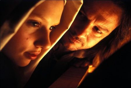
Girl with a Pearl Earring Movie Trailer. Colin Firth had not read the book when Paterson and Webber approached him to play the artist Joannes Vermeer, but read the script and quickly accepted the role. He says, “It felt refreshing. It takes itself seriously, which is not a popular position in most films—it is safer to have your tongue in cheek these days.” He regarded the role as an acting challenge. “Not a lot of big things happen on the surface; the action is minimal, finely focussed drama, which must be made interesting by the characters.” He adds, “This has a parallel with the work of Vermeer.”
Firth was intrigued by the man himself. “Not a lot is known about him. He painted what modern critics could regard as cliches—images reflecting the conventions of the time. But there is an even-handed moral kindness in those paintings, showing humanity in equal terms to one another, whether milkmaid or mistress. Of the 35 paintings known today, about 20 were painted in the same corner of the same room. He lived in a lively household—eleven of his children survived, but he painted serenity in his first floor studio. In 17th Century Delft artists were craftsmen who took their civic duties seriously—they served apprenticeships, and had a union to protect their economic rights. Long before the cult of the tortured rebellious artist took over, it was perfectly possible to be a good citizen and husband.
In the film, Vermeer’s studio is a quiet retreat from a noisy household. Says Firth, “He is resigned to being surrounded by people who don’t understand what he does and keeps his world separate. When he does understand what he does allow someone in for the first time he is intrigued that Griet has an eye for color and composition and forms a mysterious bond across a vast barrier of class and age. He is sometimes pleased with what she has done, and sometimes rejects it. He attempts to distance himself from intimacy—it is too complicated for him. He doesn’t allow himself to focus on the foreground of paintings or feelings for long, and so he doesn’t find the same level of engagement each time they meet. So the relationship becomes tortuous for both of them.”
Although Firth researched the man and his paintings thoroughly, he did not learn to paint. “At my level of talent it was almost pointless,” he explains, “but what I can do is imagine that I can paint, and convince other to imagine that I can. I hold a brush and mix paints to look as if I know what I am doing. Besides, probably a great painter and a terrible painter look the same holding a brush.”
Firth found Peter Webber keen to explore the effect of different nuances on scenes. “Where a script is so affected by the tone, a change of emphasis can completely change the direction of a scene.” The actor points out parallels between filming, and the work of Vermeer. “If you look at x-rays of his paintings, you can see that he was prepared to begin with one idea and then throw that away.
this can happen on a film set. Working with a crew is a huge collaborative effort. Everyone arrives in the morning and the challenge of the day is to give life to the written word, but you have to be prepared to change the ideas you brought with you that morning, in order to keep the energy and carry the room. If you are in tune, you can feel that moment. It’s palpable.”
Firth emphasises that the film is not an art lesson. “It’s an exploration of how powerful a relationship can be—like the intimacy between artist and model. A painting is unveilled and disrupts a family.”
“It was very difficult to nail anything—Vermeer’s character is utterly elusive….We don’t even know what he looked like, so it made the exercise a completely creative one for Tracy Chevalier and for the rest of us as well….It’s hard to talk about any paintings without sounding airy fairy, but there’s something going on in works that’s difficult to describe. You can call them jarring, restless, but that doesn’t do. I found myself in motion trying to chase after what it is.” (W, Nov 2003)
Re-creating Vermeer’s World
“The scene is a familiar room, nearly always the same, its unseen door is closed to the restless movement of the household, the window open to the light. Here a domestic world is refined to purity.” — Lawrence Gowing: “Vermeer. ”
“The look of the period is, of course, very well documented in the extraordinary paintings of the Golden Age of 17th century Holland,” says production designer Ben van Os. “We conceived Vermeer’s house to give us that sense of frames within frames so familiar from the paintings; a passageway leading from the canalside into the courtyard and the ground floor rooms connected by open doorways, leading the eye through the house to give a feeling of space—and lack of privacy. Griet should always feel watched.”
“Peter (Webber) and I also felt that many of the paintings gave an idealized view. We took the decision to introduce a gritty reality, particularly to the exterior scenes—filling the streets with livestock and mud.”
The interiors were divided into three distinct worlds. Griet’s family home is a monochrome ordered Calvinistic abode in the poorer quarter; the Vermeer family lives in lurid Catholic chaos with lots of paintings on the walls (Vermeer was also a dealer who sold the work of others) and the vivid colors of popery; his rich patron Van Ruijven’s world is opulent, with curiosities from around the world. This is where the real power lies.
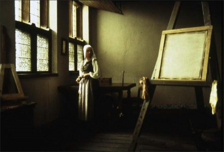
“I wanted the Vermeer house to be chaotic—downstairs” says Webber. “The house was full of children and noise. It looked out onto a canal which must have been very smelly. The main square with its taverns and markets was just half a block away. Yet Vermeer created; paintings which seem to define tranquility and perfection. So we were determined that the studio, the room that contained that familiar, almost holy corner represented in so many of the great paintings, should be the magical space. Up there is Vermeer’s private world—a world which he gradually allows Griet to share because she alone understands why it is special. Ben built gorgeous sets, but he is also a great set dresser, making the world believable, lived in and totally convincing.”
Cinematographer Eduardo Serra used different film stocks for the different worlds, capturing the rich dark colors of the downstairs of Vermeer’s house and saving something for the painter’s studio. “The shooting schedule worked in such a way that we saved Vermeer’s studio for last” remembers Paterson. “One day I was watching the stunning footage from elsewhere in the Vermeer house and reminded Eduardo of the earlier discussions about saving such beauty for the studio. He nodded that he hadn’t forgotten. And when I saw what he did in the studio, it was breathtaking. He took it to another level altogether.” “Eduardo’s work was quite extraordinary” adds Webber. “He had decided how he wanted every frame to be lit and seemed able to achieve it almost instantly.”
Dien van Straalen’s costumes were the final element in creating an authentic world. “Most of the time you should hardly be noticing the costumes,” says Webber. “Great costume designers make clothes that actors feel comfortable in, and it helps create the feeling that you are inhabiting a real world. Catharina’s costumes are exquisite and showy because that’s who she is, but even she has to wear the same dress on a number of occasions to reflect the financial burdens of the family. Dien’s triumph was to create costumes that subconsciously help in the telling of the story.”
Production Design in Detail
Director Peter Webber and his production team created a living, breathing, fully dimensionalized portrait of the 17th-century Dutch town of Delft on a budget of just $10 million. The secret to their success lay in the angle of attack. Webber is a passionate admirer of Stanley Kubrick’s 18th-century epic, “Barry Lyndon.” But upon reading Olivia Hetreed’s screenplay for “Pearl Earring,” Webber saw a key difference between Kubrick’s film and the one he was about to make. “Kubrick was obsessed with the spectacle and manners of the period,” says Webber. “So he staged these elaborate and expensive set pieces. My film was about the intimate relationships within a single household.”
“The characters who pass through Vermeer’s house come from a broad spectrum of society, from the very wealthy to the very poor,” says Webber. “You get a microcosm of 17th-century Holland under one roof. So the film is, in a sense, an intimate epic.”
Production Design
Finding a production designer who could bring this distilled drama to the screen proved difficult. “The various British production designers whom I spoke to approached the film a bit like it was a museum piece,” says Webber. “They wanted to get all of the period details exactly right, and were slightly scared of not getting it right.”
When Webber met Ben van Os he knew he had found the right person. “Ben is Dutch; this story is in his blood,” says the helmer. “So he wasn’t intimidated by the period obligations. He was much more interested in story and character. How are we going to create this mood? Ben said, ‘We’ll take this from this period and this from that period.’ It was music to my ears.
“The most important things are the story and the characters. I really don’t care if I’m going to get a letter from some expert in Dutch architecture saying, ‘That roof design wasn’t used until 17 years after your movie takes place.'”
Van Os created a cross-section of Dutch society by building three interior sets: the drab monochromatic, Calvinistic home of Griet; the lurid, painting-filled Catholic chaos of the Vermeer house; and the mansion of Vermeer’s wealthy patron, van Ruijven (Tom Wilkinson , filled with curios gathered on his world travels and eerie stuffed animals, which convey van Ruijven’s predatory nature.
The Vermeer house presented the biggest challenge. Van Os constructed the three-story set on one of the largest soundstages in Luxembourg. “We wanted the house to give us that sense of frames within frames so familiar from Vermeer’s paintings,” says van Os. “We built rooms with connecting doorways that led the eye through the house to give a feeling of space—and lack of privacy. We wanted Griet to always feel watched because the film is about being observed, either by Vermeer as he paints her, or by the other family members with their various agendas.”
Van Os knows that the little details give this cloistered world authenticity. “For instance, the windows are all exact reproductions of the those that were used at the time,” he says. “That was a big undertaking, quite expensive. We went to a company that restores all kinds of windows in old churches and historic buildings and had them build them for us.”
For the exteriors, Webber and van Os spread dirt and trash to give the streets the feel of a crowded city. “I was obsessed with getting animals—dogs, livestock—into as many shots as I could,” says Webber, “because it brings a breath of life to the piece.
Costume Design
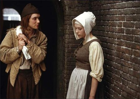
The distillation process extended to the wardrobe as well. “I wanted a stripped-down look,” says Webber. “If I dressed all the actors in the real costumes of that era, they would be wearing ruffles and baggy outfits. I didn’t want to put Colin Firth in that. For a modern audience he’s going to look too costumey. So we came up with a look we jokingly called period Prada, to give the clothes sleek lines. I called it my Vermeer filter: take the real clothes from the period and reduce them to their essence.”
Costume designer Dien van Straalen combed through second-hand clothing and furniture stores, Indian silk shops and garment marts throughout London and Holland in search of period fabrics. Old curtains and slipcovers were converted to jackets and dresses, and aged with sandpaper. The wardrobes for each character varied from prosaic to grand. Again, the clothes made up a cross-section of the 17th-century Dutch society. “We used pale colors for Scarlett Johansson to give her the drab look of a poor servant girl,” van Straalen explains.
As for Vermeer, “obviously he was not a wealthy man, though he was considerably better off than Griet. So I wanted to keep him as plain as I could. He sometimes had to go out to social events, so we gave him one aged black dress suit with a simple white collar and a bit of braid.
“Vermeer’s patron, van Ruijven, wants to control Vermeer and enjoys his power over other people. For me he was a peacock strutting around with his money. I used more braids and more gold, big hats with feathers, and cloaks. We have costume makers in Holland who used to work for the opera so they know exactly how to make fancy clothing from that period.”
Makeup and Hair
“The makeup for Scarlett Johansson was very simple,” says makeup and hair designer Jenny Shircore. “We just had to keep her skin looking milky, thick and creamy. This required some makeup because Scarlett has spots and things that happen to a 17-year-old. We wanted to present her as if she had no makeup on. We gave her a little bit of help by bleaching her eyebrows, because in the Vermeer paintings it’s all about skin and face, nothing else gets in the way, so you eliminate those other features.”
Almost all of the actors wore wigs, which presented problems. When Johansson’s wig arrived a couple of days before shooting, it had the wrong color and texture. “It was a nightmare,” Shircore laughs. “I didn’t dare say a word to Peter, because I thought: ‘We must sort this out without giving him a headache.’ We were up all night dyeing, straightening, curling and redyeing the wig.”
“For Vermeer’s wife, Catharina (Essie Davis), I used a very simple Dutch hairstyle. The women wound their hair round the back of their heads. There comes a point when you’ve finished the hair, it can’t be wound anymore because the length is used up. Instead of neatly pinning it away, we let the ends splay out, because in looking at references, little drawings and prints, we found that that’s what they did. Once you’re actually working within a period, the hairstyles evolve very naturally.”
Girl with a Pearl Earring (2003)
Directed by: Peter Webber
Starring: Colin Firth, Scarlett Johansson, Tom Wilkinson, Essie Davis, Alakina Mann, Cillian Murphy, Judy Parfitt, Leslie Woodhall, Gabrielle Reidy, Anna Popplewell
Screenplay by: Olivia Hetreed
Cinematography by: Eduardo Serra
Film Editing by: Kate Evans
Costume Design by: Dien van Straalen
Set Decoration by: Cecile Heideman
Art Direction by: Christina Schaffer
Music by: Alexandre Desplat
Distributed by: Lionsgate Films
MPAA Rating: PG-13 for some sexual content.
Release Date: December 12, 2003
Views: 157
