Nim’s World: The Design
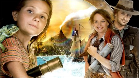
Nim’s Island takes place largely on a remote sea island alive with both natural enchantment and a youngster’s unlimited imagination. To find locations that would capture the charm, beauty and dangers of Nim’s life in the middle of the ocean, the production journeyed all the way to the other side of the world — to Australia, itself a giant island nation lined with lush rainforests, golden beaches and stunning underwater reefs.
“We needed a true tropical environment, as well as a place that had a really strong film infrastructure. We also needed to find a place the looked like `the most beautiful island in the world’! We found all of that and more in Australia,” says Paula Mazur.
Ultimately the production would shoot on Queensland’s Gold Coast, renowned for its sun-splashed beaches, on soundstages (where the Sea Lions could safely romp in water tanks and through the specially constructed treehouse where Jack and Nim live) and on Hinchinbrook Island – once home to Aborigines and now an Australian National Park filled with luxuriant forests, sweeping sandy beaches and mangrove-fringed shores – a wild paradise worthy of Nim.
In designing the look of the film, Mark Levin and Jennifer Flackett teamed up with a trio of artisans: cinematographer Stuart Dryburgh, who won an Oscar nomination for his lyrical and evocative work on Jane Campion’s New Zealand-set epic The Piano; production designer Barry Robison, whose designs have spanned from the comedy hit Wedding Crashers to the forthcoming X Men: Wolverine; and costume designer Jeffrey Kurland, who was Academy Award nominated for Woody Allen’s period drama Bullets Over Broadway.
Dryburgh says he was attracted to the film because it was a chance to delve a bit into magical realism, a style with which he’s always been fascinated. “The idea with NIM was to hit a lovely balance between the real world and a more fantastical world of imagination,” he explains. “Nim’s Island definitely feels like a real-world place, but we wanted to make it just a little bit more special.”
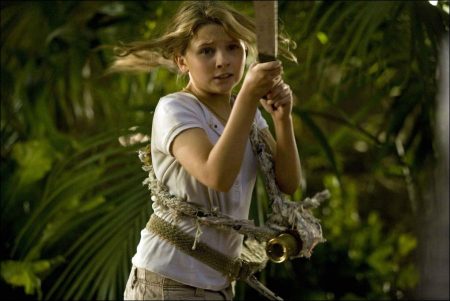
One of the challenges for Dryburgh was finding ways to visually match scenes that were shot on soundstages, especially the treehouse set, with those shot in real rainforests. Comments Dryburgh: “That’s where lighting comes in. Another thing we did to give our theatrical rainforest a more natural look was to put in an atmosphere of water vapour, so there was constantly a sense of mistiness and dampness to all the vegetation. We placed a very complex rig onto the roof, sort of like the kind of thing you would use inside a huge greenhouse to mist tropical plants. It was extremely effective.”
As for Dryburgh’s favorite shot, he demurs that he has several, but notes: “Every once in awhile you catch things that really stand out and one of those for me is when Nim is standing at the front of her father’s boat when they’re going out to the supply ship. You’ve got the ship sailing, Jack driving, the beautiful islands behind, the sun shining and it’s just a really uplifting, magical moment.”
Production designer Barry Robison worked closely with Dryburgh to maintain that sense of what he calls “reality but a dreamy reality” in the look and style of the film’s major sets. Robison began with extensive conversations with Levin and Flackett about how to create and contrast Nim’s thrilling treehouse on the island with Alexandra’s isolated house in the middle of San Francisco. “I’ve never worked with two directors with such strong design sensibilities,” he says. “So right away, it was a fun process.”
At the center of that fun would be building Jack and Nim’s fanciful treehouse-style home and laboratory from scratch. This unusual household had to work on a practical level yet also evoke unusual childhood dreams. “I think nearly everyone has dreamt of living in a treehouse like Nim,” says Levin. “It’s a really fun and magical place because of that.”
Robison had at first hoped to construct the treehouse on the limbs of an actual tree inside a real rainforest on Hinchinbrook Island, where the production would shoot much of the outdoors footage of Nim’s Island — but his plans were toppled by… animals. When Robison learned that Nim’s Sea Lions friends would need to be on a soundstage to assure their safety, he tapped into his theatrical background to create a slice of outdoor wildness with an elaborate indoor set. “Building that set on a stage was very brave of everybody,” says Robison. “And working with Stuart Dryburgh really made the difference. He’s a fantastic Director of Photography who was able to make the treehouse feel a part of the island.”
When it came to the blueprints for the eccentric abode, Robison worked closely with art directors Jacinta Leong, Deborah Riley and Supervising Art Director Colin Gibson as well as a group of young architectural students from local colleges in Brisbane, in a feat of intense engineering. “We had to first construct the tree, which was based on the complex structure a real fig tree with an incredible root system, and then the main house of top of that and then Jack’s lab,” he explains. “I really wanted to bring a very young, fresh, spontaneous feeling to it, so it was great to work with so many young people who think outside the box.”
The piece de resistance of the treehouse was Nim’s bedroom, a second-story hideaway reached by an elaborate staircase and featuring an inspirational peaked roof with a crow’s nest lookout over a panoramic view. Befitting Jack and Nim’s love of nature, the treehouse also featured a lot of modern “green” innovations, including solar and wind power generation, a roof designed to catch rainwater and even composting areas. Robison used sustainable bamboo wood and biodegradable plastics throughout.
“Barry thought a lot about what it means to be living off the grid on an island in the 21st century, growing your own food, and living a self-sustaining way,” explains Flackett. “All the green touches bring a very modern and real aesthetic to Nim and Jack.”
The details were important, but it was the overall picture that excited Robison. “In the end the most important thing is that the treehouse had a very light, fun feeling – it had the essence of Nim,” Robison summarizes, “and when you were in that space, it really felt magical.”
The directors, too, were thrilled with what Robison and his team achieved. “The treehouse truly felt like home, like the kind of place we’d really like to live. And that’s what we wanted to get across – it’s a very special place that’s not like anywhere else.”
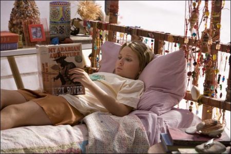
Robison was equally challenged by another key set: Alexandra Rover’s Victorian-style San Francisco apartment, where the author of the world’s most popular adventure novels hides away from a world that secretly seems all too big and scary to her. He had to come up with a way to make her place feel like an oasis right in the middle of a claustrophic, chaotic city. “This was a very complicated set that took all of my theatrical training,” notes the production designer, “When you see Alex open the front door, and you see the Golden Gate Bridge and San Francisco beyond, it’s all forced perspective, which was a real challenge to pull off.”
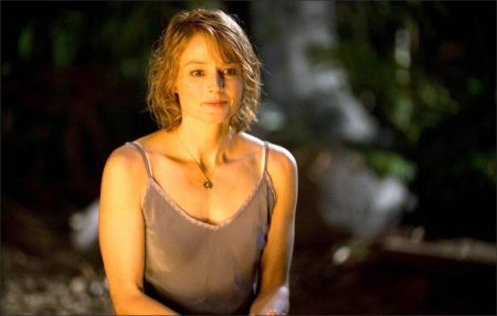
Inside Alexandra’s home, the design team filled the space with an eclectic array of objects from every corner of the planet. “You get the sense of a woman who has tried to live a very worldly life without ever leaving her home,” notes Mazur. “This feeling was really important to Jodie.”
Although Robison had a blast with both the apartment and the treehouse, his favorite design in the film is even more whimsical: he adores the film’s eye-catching opening sequence of a ship riding through paper cut-out waves as Nim recounts the rocky story of her life so far. Inspired by the clever, artsy fun of pop-up books and a child’s-eye view of memory, Robison convinced the directors to allow him to design the 3-dimensional imagery with miniatures, models and paper puppets rather than using the more conventional CG.
“Sometimes the simplest tricks are the most magical because kids have imaginations that love to run wild,” he says of his approach. “I believe you don’t have to be told everything, and that sequence turned out to be pure and simple enchantment.”
That sense of enchantment was felt throughout the production for Mark Levin and Jennifer Flackett, both in the performances and in every aspect of the film’s design. Sums up Levin: “Everyone worked together to create this beautiful place and this wonderful story and to really reflect the worldview of Wendy Orr’s book. NIM’S ISLAND becomes a place where you can escape into imagination and I think people will find that it’s not quite like anywhere else they’ve been – it’s an original experience.”
Nim’s Island (2008)
Directed by: Mark Levin, Jennifer Flackett
Starring: Jodie Foster, Gerard Butler, Abigail Breslin, Alphonso McAuley, Rhonda Doyle, Russell Butler, Bryan Probets, Andrew Nason, Dorothy Thorsen, Colin Gibson, Christopher James Baker
Screenplay by: Jennifer Flackett, Mark Levin, Joseph Kwong
Production Design by: Barry Robison
Cinematography by: Stuart Dryburgh
Film Editing by: Stuart Levy
Costume Design by: Jeffrey Kurland, Kurgu: Stuart Levy
Set Decoration by: Rebecca Cohen
Art Direction by: Colin Gibson, Jacinta Leong, Deborah Riley
Music by: Patrick Doyle
MPAA Rating: PG for mild adventure action and brief language.
Distributed by: Fox Walden Studios
Release Date: April 4, 2008
Views: 158
