Star Trek – Lights, Camera, Cosmos
Star Trek Movie Trailer. One of the eternally compelling themes of “Star Trek” is how human beings put ingenuity, passion and optimism to work in tackling seemingly impossible problems. The production took those precepts very much to heart. Astonishingly, the epic shoot that recreated a cosmos light years away from earth was shot almost entirely in Southern California and not primarily on stages, but at practical locations, which meant that the crew initiated such total metamorphoses as turning a beer factory into an Engine Room and a baseball stadium parking lot into a desolate ice planet.
This was the way J.J. Abrams, always spurred by imagination, wanted it. “So much incredible stuff that is almost unimaginable to us happens in `Star Trek,’ so I wanted to always keep it feeling as real as possible, emotionally and physically,” he says. “I didn’t want to have it all be green screens and CG. I wanted to build as much as possible, which meant a really intricate process that involved a lot of discussion about every detail, from what the interface on the dash of a 23rd century car looks like to how a ship fires on another ship.”
Like the captain of a ship, Abrams surrounded himself with people who had already earned his trust: cinematographer Dan Mindel (from “MI:3”); editors Maryann Brandon and Mary Jo Markey (from “MI:3” and “Alias”), production designer Scott Chambliss (“MI:3,” “Alias”), and a newcomer to the team, costume designer Michael Kaplan (“I Am Legend,” “Miami Vice,” “Mr. & Mrs. Smith”). Also re-teaming with Abrams from “MI:3” was Industrial Light & Magic’s Roger Guyett, who has also served as visual effects supervisor on some of the biggest adventure films of recent years, including the “Pirates of the Caribbean” series, “Star Wars: Episode III” and several “Harry Potter” films. Guyett also took on the role of second unit director.
Chernov continues: “J.J.’s philosophy was very important and it’s one I share, that you put together a crew made up of the most creative people you can find and let them do their job, always encouraging them to go farther and come up with more ideas. That spirit was contagious on this set.”
Director of photography Dan Mindel says: “What was great about the way we shot `Star Trek’ is that we were continually learning from what we did the week before and upping the production level.”
After much debate, the decision was made to shoot “Star Trek” in anamorphic widescreen. “We all wanted this movie to feel as huge as space itself, and widescreen gave us the expansive, cinematic feel `Trek’ has never had before. I’ve always believed that movies should be about creating a complete illusion. There’s something magical about what we’ve done: keeping the effects very organic and using analog photography to make a high-tech space movie,” Mindel says.
Fans of past “Star Trek” movies will definitely be in for a fresh experience. “This `Star Trek’ has J.J.’s touch,” says Mindel. “The way we approached it is that the viewer is the camera and the camera is never standing still, which makes for a feeling of constant adventure, exactly what you would feel if you were on the Enterprise light years from home.”
Take It To The Bridge
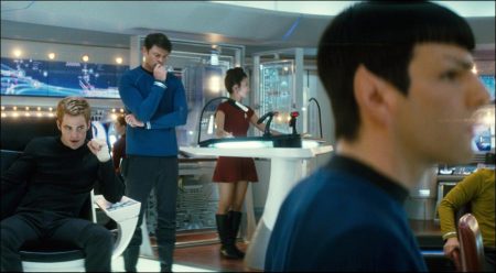
How do you update and refresh one of the most iconic motion picture sets of all time? This was what the production crew of “Star Trek” was up against as they began tackling how to design the U.S.S. Enterprise and, most especially, the Bridge, the nerve center of the ship, where the commanding officers steer her through the stars. Accessible only by turbolift, the Bridge contains a communication station, a science station, a helmsman station and a navigation station, all encircling one of the most recognizable pieces of furniture in modern storytelling: the Captain’s chair.
When it came to doing a renovation on the Enterprise, Abrams and his design team knew they would have to walk a very fine line – one that would utilize free imagination, yet, at the same time, respond to and reflect the legacy and logic of a Starfleet future that has already been seen by many on the television series and movies.
“We had to walk the line of being consistent with the timeline of the series while at the same time finding our own look that would be futuristic and cool for today’s audiences,” Abrams explains. “For example, 40 years ago the communicator seemed truly futuristic but now we all have tiny phones in our back pockets that look a lot like that. So the approach was to take what was familiar about `Star Trek,’ especially on the Enterprise’s Bridge, and expand outward from there, making the design more beautiful and incredible, what we now envision of the 23rd century’s design from our present.”
Much of this task fell to production designer Scott Chambliss, who started by laying out a framework of ground rules that would affect every knob, button and gadget. “The first rule was that we wanted to pay tribute to the great optimism of the original television series and the hopeful idea that technology was going to be a real boon for humankind. We wanted to avoid the sorts of dark, morbid visions of the future that have lately become popular in sci-fi because Gene Roddenberry was coming from a very different place,” he begins.
“We also wanted to balance that optimism with a real functionality to everything on the set, where everything looks like it really works, which was so important to J.J.,” he continues. “There was a strong, sleek, modernist vision at play in the 1960s when the television series began and that was something we wanted to infuse into our look. The Enterprise has a sleek sexiness to it, whereas the older Kelvin has a more typical militaristic style to it. Our Enterprise draws from work of great designers of the period like Pierre Cardin and also from Kubrick’s `2001′ by honoring, though not mimicking, those sensibilities.”
After compiling an initial set of images for Abrams, Chambliss worked with a whole phalanx of illustrators, model builders and designers. “Each person brought their own incredible gifts and insight to this gigantic, aesthetic adventure,” he says. Chambliss had the joy of being able to tackle familiar elements on the Bridge with far more advanced technology at his disposal. “Technology has allowed us to add layers and depth to the overall magic of the Bridge,” says Chambliss. “We were able to do things on this Bridge that no one else ever has. It’s not just a literal recreation of the old Bridge. It’s fresh and new, yet you instantly have that feeling of `I’m on the Enterprise’s Bridge.’”
Along the way, Chambliss worked closely in concert with visual effects supervisor Roger Guyett. “Scott and I had long conversations about what the most efficient approach was for what he needed to physically build and what we would add synthetically later,” notes Guyett. “So he could, for example, build the Bridge of the Enterprise knowing what the view out the main window was really going to look like. Scott is a great collaborator and it was a rewarding process.”
Guyett’s main focus on the Bridge was the panoramic window so central to the concept since its inception. “In the original, the window was almost like a TV screen that switched on and off. So one of the things we wanted to do differently was to use that as a real window, like a car or airplane window, so you had a constant connection to the environment these guys were in – a link to that very specific universe.”
The Bridge set was built on gimbals so that it could twist, shudder and tilt in viscerally realistic ways when coming under attack or accelerating into warp speed. Explosions on the ship were shot live-action to up the ante for the cast and photographic team. “You want to see the imminent danger in the faces of the characters and feel that the Enterprise is in peril,” says Guyett. “We shot the live-action sequences knowing that we would be adding a lot of CG later and allowing J.J. to shoot as he wanted without restrictions.“
For Abrams, that feeling was palpable. “Scott and his team designed a Bridge completely in the spirit of the original show and movies, but one that raises the bar and makes it all that much better and more interesting. When I first walked on the set of the Bridge, I had the feeling not of being on another set, but of being somewhere really special. It was like crossing a threshold. There was this moment of `oh, wow, we are really going to make this world real.’”
Mining the Darkness: The Narada
There could be no starker contrast with the Enterprise’s forward-looking beauty and stylishness as that of the gargantuan, dark, threatening Romulan mining vessel, the Narada. The crew of “Star Trek” was thrilled to have a never-before-seen ship they could design completely from scratch, especially one as mind-bogglingly huge (several miles long by several miles high) and unusual as the Narada.
“We were able to start fresh on the Narada,” comments Chambliss, “and it was a chance to really emphasize the culture of the Romulans, who are related to the Vulcans way back, but have let their emotions hold sway, making for a very different society. Romulans are volatile and violent, so I always felt that their ship would be more like a living, breathing organism.”
In creating the Narada’s skeleton-like, exposed interior, Chambliss was influenced by the Spanish architect Gaudi, who liked to reveal the inner structure of buildings, turning architecture inside out. “We started with the idea of having all these cables and pipes that were like the ligaments, tendons and nerves of the ship,” he comments. “It draws you into this dark, mysterious world.”
Once he had a vision of the ship’s sprawling architecture, Chambliss also had to come up with a way to create a ship of nearly inconceivable proportions on one of Paramount’s largest soundstages. He explains the team’s creative solution: “What we did was to create modular anchor pieces of the Narada that we could reconfigure at will to form new spaces. J.J. embraced that notion right away and we were able to give him five or six different looks at the Narada from a single stage.”
Shooting the Narada was one of the most exciting tasks facing Dan Mindel’s camera team. “Scott had come up with this ingenious idea of a totally modular set with all these moveable elements that was very creative,” says Mindel. “We had no idea how it was really going to work until we got there, but it turned out to be amazing. It has a completely different feel from the Enterprise, scary, foreboding and ethereal and, in its own way, quite groovy.”
While the design team’s largest ship-forging tasks were the Narada, the Enterprise and the Kelvin, there were also smaller vessels to be designed, most notably a re-think of the famed Starfleet shuttle and Spock’s so-called “Jellyfish” ship, which was modeled in part after the design of a particle collider, and has a shape and movement unlike any other starship. “Different art directors were responsible for each ship,” explains Chambliss. “Dennis Bradford was responsible for the Enterprise and the Kelvin; Gary Kosko oversaw everything that was Vulcan-related and Curt Beech was responsible for all the shuttles. They were all overseen by supervising art director Keith P. Cunningham, who kept everything organized and running. Along with our incredibly gifted set decorator Karen Manthey, this team contributed so much to the look of the movie.”
Icebound on Delta Vega
One of the eternal joys of “Star Trek” is the fun of the crew (and by extension, the audience) getting the chance to discover brand new planets and living beings unlike anything an earthling has ever seen before. To keep the thrill of exploring the stars front and center throughout the film, Abrams made creating realistic planet environments a priority, from the dry, rocky planet Vulcan, to the far, frigid reaches of remote Delta Vega.
From the beginning, a big question for the production was how to create Delta Vega, the bone-chilling ice planet. Initially, Chambliss and Abrams made plans to shoot in Iceland but Chambliss decided to challenge himself by coming up with a way to forge a desolated, glaciated world outdoors in sunny Southern California.
He did so in the most unlikely of places, the parking lot of Dodger Stadium, which afforded the team enough space to create an entire planet, yet was high enough above the city to allow a constant view of the horizon. The parking lot, an area of about 50 x 125 feet, was filled with “snow” (made out of biodegradable paper products) and the sculpted tops of jagged cliffs. “We sculpted huge glacial chunks that we could move around like chess pieces to create any configuration or angle,” Chambliss says. Then, eight huge wind machines were employed to create the havoc of blizzard conditions. Says special effects supervisor Burt Dalton:“With smart photography, visual effects and great design from the art department, J.J. was able to make these scenes look like they were happening in a wide variety of areas across the planet.
Adds Mindel: “J.J. is incredibly brave and once he made the decision to shoot outside in the elements and create those sets, he fully committed. It gives the ice planet a very true look and feel.”
It is on Delta Vega that Kirk encounters two otherworldly creatures, one that is terrifying and another that is far worse. Muses Roger Guyett, “Here we were at Dodger Stadium, and we had this ice planet and imaginary beasts with wind blowing snow everywhere – it seemed like total chaos, yet it proved to be a very efficient way of shooting both scenes.”
The Drill Platform
Also built at Dodger Stadium was a very different, and equally alien, environment: the suspended-in-air drill platform, which serves as Enterprise’s first big mission as the crew makes a daring “space jump” into a fiercely hostile situation.
To recreate this deep space mining platform and one of the story’s central set pieces, Chambliss built his set literally up in the air, towering 16 feet above the ground, and covered it with a rubberized surface that would allow the actors and stunt men to fall and tumble without harm. Here too, huge wind machines were employed to simulate the platform’s volatile atmosphere, and the cast was swathed in harnesses and wires that allowed them to safely parachute onto and fight on the platform without tumbling into the abyss.
“The difficult thing was making it look like the people are actually parachuting down, rocketing head-first and then snapping into position as if a parachute had pulled you up,” says Burt Dalton.
Later, Roger Guyett’s visual effects team would expand the scenes with CG. “It all came together in a very exciting way,” he says.
Adds Jeffrey Chernov: “The space jump was one of the biggest pieces of the puzzle we had to solve: How do you do it realistically and safely? We had to baby-step our way through it because it was completely new territory. Shooting both Delta Vega and the drill platform at Dodger Stadium was a bit insane. If we’d put it in the hands of someone who wasn’t a master multi-tasker, it would have been a disaster. But it was right up J.J.’s alley. He loved it and thrived on it.”
Meanwhile, to stand in for the planet Vulcan itself, which is part of another major set piece, the production headed to nearby Vasquez Rocks Natural Area Park in Agua Dulce, where unique geological formations have already become part of Trek legend, having been used in the 1960s to shoot such episodes as “Shore Leave,” “Arena,” “The Alternative Factor” and “Friday’s Child.”
“Vasquez Rocks is such a cool place with this whole television history, so it felt right to shoot there,” says Chambliss. “It has this big, jutting rock formation that provided the opening for the interior tunnel that leads to the Vulcan Shelter, which we then built on a stage at Paramount. We adhered to the lore by keeping Vulcan devoid of water.”
Riding the Pipeline: Beer Factory Becomes Engine Room
One of the most beloved, but rarely seen, locales within the U.S.S. Enterprise is the Engine Room, where the chief engineer works his magic to keep the ship aloft, no matter what kind of attack the ship comes under. In “Star Trek,” a young Scotty finds his first introduction to the Enterprise is an adventure in itself, as he is accidentally beamed into the very innards of a cooling pipe.
To shoot Scotty’s wild ride through the inner Enterprise, the production team made a new home in another highly unexpected place: a Budweiser beer plant in Van Nuys, California. Within the plant, the giant tanks and stainless steel tubing made for the perfect simulation of the pristine guts of a working starship. “We were searching for a place with tremendous scale and a place that would contrast with the Kelvin’s engine room, which was shot in a grungy Long Beach power plant built in the `30s,” says Chambliss. “When our brilliant supervising location manager Becky Brake came back with photographs of the Budweiser plant with these huge, sparkling, stainless steel tank rooms, we knew it would be perfect. The scale of the place was simply phenomenal.”
Adds Mindel: “With its huge spaces, the plant was able to give us the dimension and depth J.J. had envisioned for the interior spaces of the Enterprise. The patina of the walls and the tanks was just perfect. ou could never replicate that on a sound stage.”
Inside the plant, the weather was a chilly 41 degrees, so everyone had to wear parkas, but the sudsy atmosphere only added to the fun, says Simon Pegg. “We’ve never really seen the full inner workings of the starship before this and the Budweiser plant was huge and impressive, just as J.J. wanted it to be,” he says.
Red Shirts to Space-Diving Suits: The Costumes
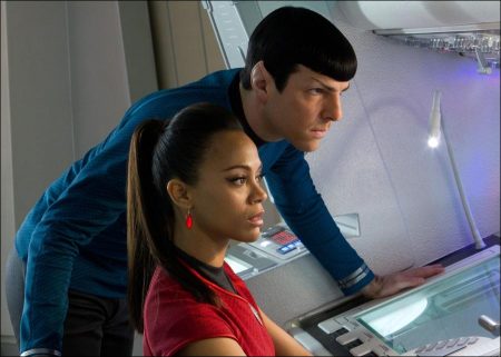
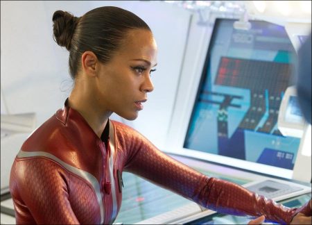
Few costumes in film and TV history are as instantly recognizable as the Starship Enterprise uniforms, with their slim-fitting black pants, color-coded tops and Starfleet boomerang logos. So the mission facing “Star Trek’s” costume designer, Michael Kaplan, was at once huge and subtle, as he battled against time to create thousands of costumes that would update the familiar and reflect J.J. Abrams’ vision of a bright, brilliant future full of style and functionality.
Kaplan previously won the British Academy of Film and Television Award for his costume design work on another futuristic classic, Ridley Scott’s dystopian fantasy “Blade Runner,” and more recently designed Francis Lawrence’s hit last-man-on-earth fantasy “I Am Legend,” as well as many other style-forward films such as “Mr. & Mrs. Smith,” “Fight Club” and “Miami Vice.” But when he was approached by Abrams, Kaplan had never seen any of the Trek movies and only a handful of the original television episodes. Nevertheless, he decided to take the meeting.
Since both men were vacationing on the East Coast, Kaplan met with Abrams in a Maine coffee shop, where they engaged in a lengthy two-hour conversation about galactic worlds and space uniforms. “It was really J.J.’s enthusiasm, energy and charm that sold me on doing the project, more than the notion of `Star Trek’ itself,” he says. “He saw my lack of Trek knowledge as a plus because he wanted the film’s entire design team to come at the designs freshly. I liked that point of view – it took away any intimidation.”
Once he took on the job, Kaplan had not a moment to spare because the production date was fast approaching. He dove into basic research, utilizing the famous Star Trek Encyclopedia to get a sense of the evolution of Starfleet uniforms and the motifs that have been repeated in every iteration of the Trek universe. Then, he unleashed his imagination as he began sketching. “It was an intuitive process,” he explains, “of deciding on a case-by-case basis what we would hold onto from the past and where we could expand into new ideas. I was motivated by J.J.’s excitement for what we were doing.”
Kaplan split the film into different eras. For example, for an earlier era of Starfleet with Kirk’s father, he went back to a `50s-tinged view of the future. “I looked at `40s and `50s sci-fi movies for inspiration in creating a look, with items like stretch pants and other retro-futuristic designs, that would naturally predate the `Star Trek Enterprise’ look that was born in the 1960s,” he says. Other distinct eras include that of civilian earth during Kirk’s adolescence and, a few years later, the placePlaceNameStarfleet PlaceTypeAcademy full of young cadets.
Then came the Enterprise uniforms themselves. “With the Enterprise uniforms, there was a certain wholesomeness that we wanted to hold onto. We didn’t want to throw away that indelible `Star Trek’ look. We updated the uniforms by simplifying them and using some manufacturing technologies that didn’t even exist when the original television series came out,” he notes. “For example, each of the uniforms is very subtly printed with tiny Starfleet logos that you can’t really see from a distance, but add a cool texture to the look. It was a painstaking process, printing on red, trying to get just the right chemistry with the ink colors.”
For the Romulans on the Narada, Kaplan matched his costumes to the grit and grime of the environment around them. “The Narada is actually a mining ship, so I wanted the ship’s crew’s clothing to have a kind of rugged work wear look to them,” he explains. “I found some fabrics at a flea market that had just the right feeling, top-stitched and aged, looking like grease had been rubbed onto them. I approached the makers, who happened to be based in Bali, and they manufactured my costume designs in their fabrics.”
For the Vulcans, he concentrated on their most prevalent qualities. “They are all about elegance and austerity because they’re such a cerebral society,” he comments. “I also developed a whole new silhouette for the Vulcan women, with a corseted shape that hasn’t been seen before.”
Kaplan’s team had some of the most fun with the skydiving, or rather space-diving, outfits the Enterprise crew wears as they leap for the drill platform above the planet Vulcan. “They were quite complicated because we needed the suits to look as though they could endure such a long jump. The helmet ventilation system needed to work, otherwise the visors would fog up. We also had to produce them in different colors so that you could differentiate between each actor when they were in the air. The suits were a challenge, but I think what we came up with was very successful.”
At Warp Speed: Pushing the Visual Scope of Star Trek
Few long-lived stories demonstrate the lightning-speed evolution of visual effects in the last few decades as well as “Star Trek.” The original television series was created using cardboard sets, blinking lights and a shoestring budget. Later, in the wake of “2001,” “Star Wars,” “Alien” and other groundbreaking effects movies set in outer space, the first series of Trek movies pushed a rapidly progressing technological envelope, using futuristic technology that the television audience could never even have imagined.
In a sense, that evolution has come to its logical conclusion with this “Star Trek,” as Industrial Light & Magic joined with J.J. Abrams to create the most visually spectacular Trek adventure yet seen, upping the bar in its depiction of spacecrafts, planets, explosions and the very geography of the galaxies. That team was led by Visual Effects Supervisor Roger Guyett, who had honed his collaborative relationship with Abrams on “MI:3,” although that film’s earthly setting was downright conventional in comparison to the cosmological array of effects Guyett faced on “Star Trek.”
When it came to generating visuals for the film’s non-stop space battles, creature chases and planetary catastrophes, Abrams gave to Guyett one prime directive: realism. “I wanted to bring a physical reality to traveling on the Enterprise, and I wanted to create a spectacle, but I also didn’t want the effects to ever seem more important than the characters on the ship. Roger was the one person I knew who could brilliantly use effects to connect the aesthetic and the storytelling of the movie,” says the director.
To keep a sense of history, Abrams asked ILM to compile a “greatest ever” reel of all the best effects shots ever seen in every iteration of the previous Trek movies. “Great as they are, we quickly realized that what we can do now technologically is superior to anything that was done before,” he says. “It was an honor to be able to bring the high level of visual excitement `Star Trek’ deserves. ILM took this array of alien planets, otherworldly creatures and cosmic images and elevated them beyond my wildest dreams.”
Guyett’s team was inspired by their mission, but they faced a daunting challenge. “We knew that J.J. definitely didn’t want to shoot most of this movie against a blue-screen,” he explains, “so the visual effects became a very collaborative process woven in with the design of each environment and used to extend the sets and locations in exciting ways – giving the movie some real scope and scale. We had a lot of production meetings, breaking each scene down to its component parts, trying to figure out what we could create later and what we had to shoot for real. It was a huge puzzle.”
Guyett used every tool available in the effects arsenal, exploring both the latest cutting-edge technology, including simulation techniques he developed on “Transformers,” and old school optical effects using miniatures and perspective. When it came to the Enterprise, Guyett’s overriding concept was to present the ship in a more emotional way. “I was thinking of how Kubrick created emotion through lighting in `2001,’ – there is a lot of darkness, the unknown,” he says. “He’d used a pretty naturalistic lighting approach in `2001,’ something we used as a template under the guidance of our director of photography, Dan Mindel. A lot of Trek movies have a stylized approach to lighting, but early on we decided we wanted to capture a more realistic quality – more reminiscent of photographs taken from the Apollo missions, for example. J.J. really wanted to take it in this direction. The whole idea is that when you see the Enterprise flying through space, you believe that it is something like that will really exist in the near future.”
Earth itself is seen in new ways, a familiar world just a few giant leaps of next-generation technology away from our own. For Guyett, one of the earthly challenges came in the crucial scene in which the teenaged James T. Kirk is stopped for speeding in his retro Corvette by a cop flying after him on an airborne “hovercruiser.” “With the `hovercruiser,’ there was a lot of talk about how we could achieve something with an incredible degree of realism with today’s technology,” says Guyett.“Hover vehicles might be on the horizon, but we’re not quite there yet! The special effects team built the hover bike on the end of a crane arm, which was attached to a very low riding car chassis so it could be safely driven around.”
Guyett had a lot of fun bringing a fresh perspective to high-tech gadgetry new and old – from the `hovercruisers’ to the Enterprise’s famed Transporter. But it was the effects Abrams needed on a vast, cosmological scale that really got his creative juices flowing.
While J.J. Abrams’ trusted crew threw themselves into carving out a majestically designed universe for the Enterprise to explore, Abrams says that all of it only exists to make the characters more real and intriguing.
Abrams concludes: “Cool as they are, the ships aren’t what really matters, but who’s on board the ships. The action and adventure of this movie is pulse-pounding because you love the people aboard the Enterprise. You want to be on that team, you want to be on the ship with them, you want to be cruising through galaxies with them on an amazing and fun adventure. And that was our mission in every aspect of the production.”
Star Trek (2009)
Directed by: J.J. Abrams
Starring: Chris Pine, John Cho, Zachary Quinto. Bruce Greenwood, Simon Pegg , Winona Ryder, Zoë Saldana, Karl Urban, Anton Yelchin, Eric Bana, Leonard Nimoy
Screenplay by: Roberto Orci & Alex Kurtzman
Production Design by: Scott Chambliss
Cinematography by: Daniel Mindel
Film Editing by: Mary Jo Markey, Maryann Brandon
Costume Design by: Michael Kaplan
Set Decoration by: Karen Manthey
Music by: Michael Giacchino
MPAA Rating: PG-13 for sci-fi action and violence and brief sexual content.
Distributed by: Paramount Pictures
Release Date: May 8, 2009
Views: 132
